Assignment #2 (demo). Solution#
Analyzing cardiovascular disease data#

Authors: Ilya Baryshnikov, Maxim Uvarov, and Yury Kashnitsky. Translated and edited by Inga Kaydanova, Egor Polusmak, Anastasia Manokhina, and Yuanyuan Pao. All content is distributed under the Creative Commons CC BY-NC-SA 4.0 license.
Same assignment as a Kaggle Kernel + solution.
In this assignment, you will answer questions about a dataset on cardiovascular disease. You do not need to download the data: it is already in the repository. There are some Tasks that will require you to write code. Complete them and then answer the questions in the form.
Problem#
Predict presence or absence of cardiovascular disease (CVD) using the patient examination results.
Data description#
There are 3 types of input features:
Objective: factual information;
Examination: results of medical examination;
Subjective: information given by the patient.
Feature |
Variable Type |
Variable |
Value Type |
|---|---|---|---|
Age |
Objective Feature |
age |
int (days) |
Height |
Objective Feature |
height |
int (cm) |
Weight |
Objective Feature |
weight |
float (kg) |
Gender |
Objective Feature |
gender |
categorical code |
Systolic blood pressure |
Examination Feature |
ap_hi |
int |
Diastolic blood pressure |
Examination Feature |
ap_lo |
int |
Cholesterol |
Examination Feature |
cholesterol |
1: normal, 2: above normal, 3: well above normal |
Glucose |
Examination Feature |
gluc |
1: normal, 2: above normal, 3: well above normal |
Smoking |
Subjective Feature |
smoke |
binary |
Alcohol intake |
Subjective Feature |
alco |
binary |
Physical activity |
Subjective Feature |
active |
binary |
Presence or absence of cardiovascular disease |
Target Variable |
cardio |
binary |
All of the dataset values were collected at the moment of medical examination.
Let’s get to know our data by performing a preliminary data analysis.
Part 1. Preliminary data analysis#
First, we will initialize the environment:
# Import all required modules
# Disable warnings
import warnings

import numpy as np
import pandas as pd

warnings.filterwarnings("ignore")

# Import plotting modules
import seaborn as sns

sns.set()
import matplotlib
import matplotlib.pyplot as plt
import matplotlib.ticker

%config InlineBackend.figure_format = 'retina'
You should use the seaborn library for visual analysis, so let’s set it up too:
# Tune the visual settings for figures in `seaborn`
sns.set_context(
    "notebook", font_scale=1.5, rc={"figure.figsize": (11, 8), "axes.titlesize": 18}
)

from matplotlib import rcParams

rcParams["figure.figsize"] = 11, 8
To make it simple, we will work only with the training part of the dataset:
# for Jupyter-book, we copy data from GitHub, locally, to save Internet traffic,
# you can specify the data/ folder from the root of your cloned
# https://github.com/Yorko/mlcourse.ai repo, to save Internet traffic
DATA_PATH = "https://raw.githubusercontent.com/Yorko/mlcourse.ai/main/data/"
df = pd.read_csv(DATA_PATH + "mlbootcamp5_train.csv", sep=";")
print("Dataset size: ", df.shape)
df.head()
Dataset size: (70000, 13)
| id | age | gender | height | weight | ap_hi | ap_lo | cholesterol | gluc | smoke | alco | active | cardio | |
|---|---|---|---|---|---|---|---|---|---|---|---|---|---|
| 0 | 0 | 18393 | 2 | 168 | 62.0 | 110 | 80 | 1 | 1 | 0 | 0 | 1 | 0 |
| 1 | 1 | 20228 | 1 | 156 | 85.0 | 140 | 90 | 3 | 1 | 0 | 0 | 1 | 1 |
| 2 | 2 | 18857 | 1 | 165 | 64.0 | 130 | 70 | 3 | 1 | 0 | 0 | 0 | 1 |
| 3 | 3 | 17623 | 2 | 169 | 82.0 | 150 | 100 | 1 | 1 | 0 | 0 | 1 | 1 |
| 4 | 4 | 17474 | 1 | 156 | 56.0 | 100 | 60 | 1 | 1 | 0 | 0 | 0 | 0 |
It would be instructive to peek into the values of our variables.
Let’s convert the data into long format and depict the value counts of the categorical features using catplot().
df_uniques = pd.melt(
    frame=df,
    value_vars=["gender", "cholesterol", "gluc", "smoke", "alco", "active", "cardio"],
)
df_uniques = (
    pd.DataFrame(df_uniques.groupby(["variable", "value"])["value"].count())
    .sort_index(level=[0, 1])
    .rename(columns={"value": "count"})
    .reset_index()
)

sns.catplot(
    x="variable", y="count", hue="value", data=df_uniques, kind="bar"
)
plt.xticks(rotation='vertical');
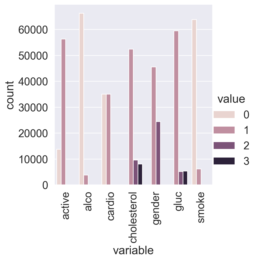
We can see that the target classes are balanced. That’s great!
Let’s split the dataset by target values: sometimes you can immediately spot the most significant feature on the plot.
df_uniques = pd.melt(
    frame=df,
    value_vars=["gender", "cholesterol", "gluc", "smoke", "alco", "active"],
    id_vars=["cardio"],
)
df_uniques = (
    pd.DataFrame(df_uniques.groupby(["variable", "value", "cardio"])["value"].count())
    .sort_index(level=[0, 1])
    .rename(columns={"value": "count"})
    .reset_index()
)

sns.catplot(
    x="variable",
    y="count",
    hue="value",
    col="cardio",
    data=df_uniques,
    kind="bar"
)
plt.xticks(rotation='vertical');
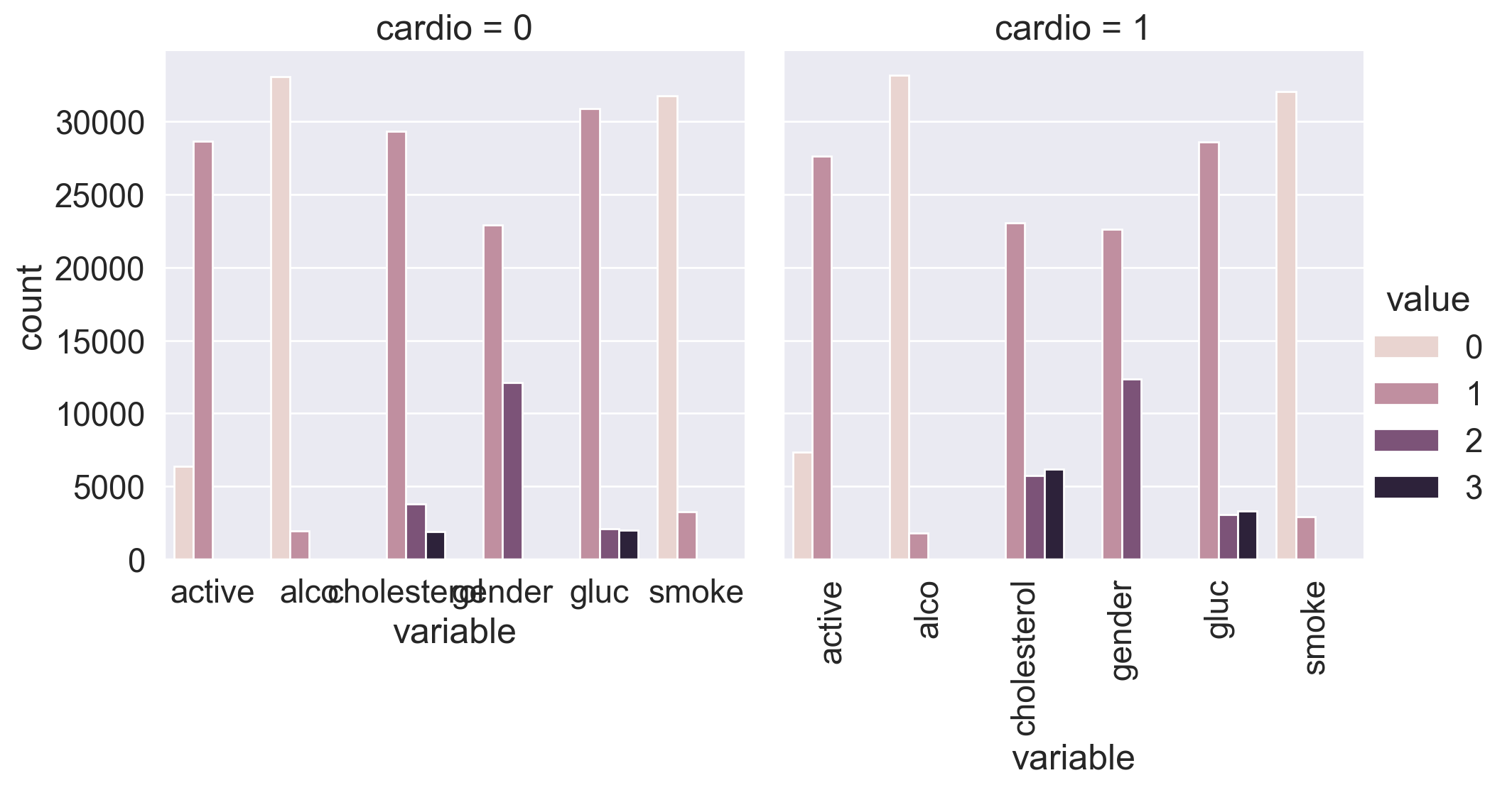
You can see that the target variable greatly affects the distribution of cholesterol and glucose levels. Is this a coincidence?
Now, let’s calculate some statistics for the feature unique values:
for c in df.columns:
    n = df[c].nunique()
    print(c)
    if n <= 3:
        print(n, sorted(df[c].value_counts().to_dict().items()))
    else:
        print(n)
    print(10 * "-")
id
70000
----------
age
8076
----------
gender
2 [(1, 45530), (2, 24470)]
----------
height
109
----------
weight
287
----------
ap_hi
153
----------
ap_lo
157
----------
cholesterol
3 [(1, 52385), (2, 9549), (3, 8066)]
----------
gluc
3 [(1, 59479), (2, 5190), (3, 5331)]
----------
smoke
2 [(0, 63831), (1, 6169)]
----------
alco
2 [(0, 66236), (1, 3764)]
----------
active
2 [(0, 13739), (1, 56261)]
----------
cardio
2 [(0, 35021), (1, 34979)]
----------
In the end, we have:
5 numerical features (excluding id);
7 categorical features;
70000 records in total.
1.1. Basic observations#
Question 1.1. (1 point). How many men and women are present in this dataset? Values of the gender feature were not given (whether “1” stands for women or for men) – figure this out by looking analyzing height, making the assumption that men are taller on average.
45530 women and 24470 men
45530 men and 24470 women
45470 women and 24530 men
45470 men and 24530 women
Answer: 1.
Solution:#
Let’s calculate average height for both values of gender:
df.groupby("gender")["height"].mean()
gender
1    161.355612
2    169.947895
Name: height, dtype: float64
161 cm and almost 170 cm on average, so we make a conclusion that gender=1 represents females, and gender=2 – males. So the sample contains 45530 women and 24470 men.
Question 1.2. (1 point). Who more often report consuming alcohol – men or women?
women
men
Answer: 2.
Solution:#
df.groupby("gender")["alco"].mean()
gender
1    0.025500
2    0.106375
Name: alco, dtype: float64
Well… obvious :)
Question 1.3. (1 point). What’s the rounded difference between the percentages of smokers among men and women?
4
16
20
24
Answer: 3.
Solution:#
df.groupby("gender")["smoke"].mean()
gender
1    0.017856
2    0.218880
Name: smoke, dtype: float64
round(
    100
    * (
        df.loc[df["gender"] == 2, "smoke"].mean()
        - df.loc[df["gender"] == 1, "smoke"].mean()
    )
)
20
Question 1.4. (1 point). What’s the rounded difference between median values of age (in months) for non-smokers and smokers? You’ll need to figure out the units of feature age in this dataset.
5
10
15
20
Answer: 4.
Solution:#
Age is given here in days.
df.groupby("smoke")["age"].median() / 365.25
smoke
0    53.995893
1    52.361396
Name: age, dtype: float64
Median age of smokers is 52.4 years, for non-smokers it’s 54. We see that the correct answer is 20 months. But here is a way to calculate it exactly:
(
    df[df["smoke"] == 0]["age"].median() - df[df["smoke"] == 1]["age"].median()
) / 365.25 * 12
np.float64(19.613963039014372)
1.2. Risk maps#
Task:#
On the web site of European Society of Cardiology, a SCORE scale is given. It is used for calculating the risk of death from a cardiovascular decease in the next 10 years. Here it is:
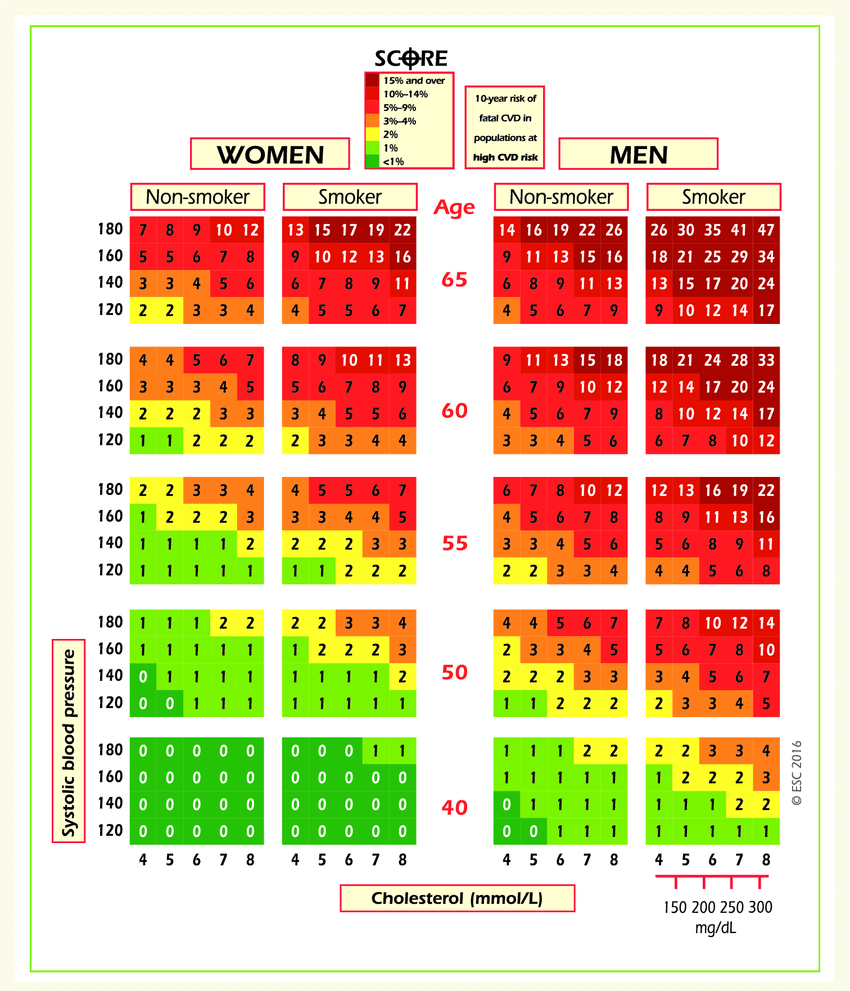
Let’s take a look at the upper-right rectangle showing a subset of smoking men aged from 60 to 65. (It’s not obvious, but the values in figure represent the upper boundary).
We see a value 9 in the lower-left corner of the rectangle and 47 in the upper-right. This means that for people in this gender-age group whose systolic pressure is less than 120 the risk of a CVD is estimated to be 5 times lower than for those with the pressure in the interval [160,180).
Let’s calculate the same ratio, but with our data.
Clarifications:
Calculate
age_yearsfeature – rounded age in years. For this task, select people aged from 60 to 64 inclusive.Cholesterol level categories in the figure and in our data are different. In the figure, the values of
cholesterolfeature are as follows: 4 mmol/l \(\rightarrow\) 1, 5-7 mmol/l \(\rightarrow\) 2, 8 mmol/l \(\rightarrow\) 3.
Question 1.5. (2 points). Calculate fractions of ill people (with CVD) in the two groups of people described in the task. What’s the ratio of these two fractions?
1
2
3
4
Answer: 3.
Solution:#
df["age_years"] = (df["age"] / 365.25).round().astype("int")
df["age_years"].max()
np.int64(65)
The oldest people in the sample are aged 65. Coincidence? Don’t think so! Let’s select smoking men of age [60,64].
smoking_old_men = df[
    (df["gender"] == 2)
    & (df["age_years"] >= 60)
    & (df["age_years"] < 65)
    & (df["smoke"] == 1)
]
If cholesterol level in this age group is 1, and systolic pressure is below 120, then the proportion of people with CVD is 26%.
smoking_old_men[
    (smoking_old_men["cholesterol"] == 1) & (smoking_old_men["ap_hi"] < 120)
]["cardio"].mean()
np.float64(0.2631578947368421)
If, however, cholesterol level in this age group is 3, and systolic pressure is from 160 to 180, then the proportion of people with a CVD is 86%.
smoking_old_men[
    (smoking_old_men["cholesterol"] == 3)
    & (smoking_old_men["ap_hi"] >= 160)
    & (smoking_old_men["ap_hi"] < 180)
]["cardio"].mean()
np.float64(0.8636363636363636)
As a result, the difference is approximately 3-fold. Not 5-fold, as the SCORE scale tells us, but it’s possible that the SCORE risk of CVD is nonlinearly dependent on the proportion of ill people in the given age group.
1.3. Analyzing BMI#
Task:#
Create a new feature – BMI (Body Mass Index). To do this, divide weight in kilograms by the square of height in meters. Normal BMI values are said to be from 18.5 to 25.
Question 1.6. (2 points). Choose the correct statements:.
Median BMI in the sample is within boundaries of normal values.
Women’s BMI is on average higher then men’s.
Healthy people have higher median BMI than ill people.
In the segment of healthy and non-drinking men BMI is closer to the norm than in the segment of healthy and non-drinking women
Answer: 2 and 4
Solution:#
df["BMI"] = df["weight"] / (df["height"] / 100) ** 2
df["BMI"].median()
np.float64(26.374068120774975)
First statement is incorrect since median BMI exceeds the norm of 25 points.
df.groupby("gender")["BMI"].median()
gender
1    26.709402
2    25.910684
Name: BMI, dtype: float64
Seconds statement is correct – women’s BMI is higher on average.
Third statement is incorrect.
df.groupby(["gender", "alco", "cardio"])["BMI"].median().to_frame()
| BMI | |||
|---|---|---|---|
| gender | alco | cardio | |
| 1 | 0 | 0 | 25.654372 |
| 1 | 27.885187 | ||
| 1 | 0 | 27.885187 | |
| 1 | 30.110991 | ||
| 2 | 0 | 0 | 25.102391 |
| 1 | 26.674874 | ||
| 1 | 0 | 25.351541 | |
| 1 | 27.530797 |
Comparing BMI values in rows where alco=0 and cardio=0, we see that the last statement is correct.
1.4. Cleaning data#
Task:#
We can notice, that the data is not perfect. It contains much of “dirt” and inaccuracies. We’ll see it better when we do data visualization.
Filter out the following patient segments (that we consider to have erroneous data)
diastolic pressure is higher then systolic.
height is strictly less than 2.5%-percentile (use
pd.Series.quantile. If not familiar with it – please read the docs)height is strictly more than 97.5%-percentile
weight is strictly less then 2.5%-percentile
weight is strictly more than 97.5%-percentile
This is not all we can do to clean the data, but let’s stop here by now.
Question 1.7. (2 points). What percent of the original data (rounded) did we filter out in the previous step?
8
9
10
11
Answer: 3
Solution:#
df_to_remove = df[
    (df["ap_lo"] > df["ap_hi"])
    | (df["height"] < df["height"].quantile(0.025))
    | (df["height"] > df["height"].quantile(0.975))
    | (df["weight"] < df["weight"].quantile(0.025))
    | (df["weight"] > df["weight"].quantile(0.975))
]
print(df_to_remove.shape[0] / df.shape[0])

filtered_df = df[~df.index.isin(df_to_remove)]
0.0963
We’ve filtered out about 10% of the original data.
Part 2. Visual data analysis#
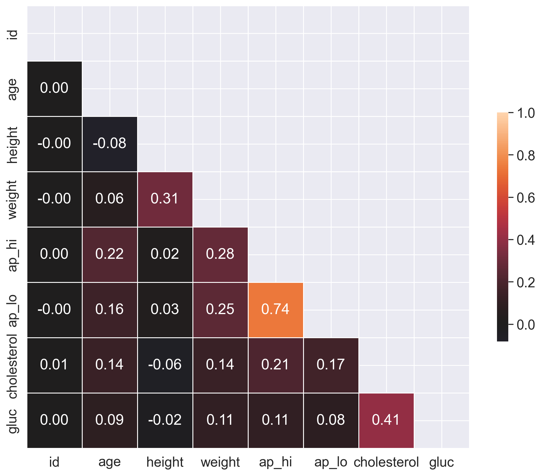
2.1. Correlation matrix visualization#
To understand the features better, you can create a matrix of the correlation coefficients between the features. Use the filtered dataset from now on.
Task:#
Plot a correlation matrix using heatmap(). You can create the matrix using the standard pandas tools with the default parameters.
Solution:#
# Calculate the correlation matrix
df = filtered_df.copy()

corr = df.corr(method="pearson")

# Create a mask to hide the upper triangle of the correlation matrix (which is symmetric)
mask = np.zeros_like(corr, dtype=np.bool_)
mask[np.triu_indices_from(mask)] = True

f, ax = plt.subplots(figsize=(12, 9))

sns.heatmap(
    corr,
    mask=mask,
    vmax=1,
    center=0,
    annot=True,
    fmt=".1f",
    square=True,
    linewidths=0.5,
    cbar_kws={"shrink": 0.5},
);
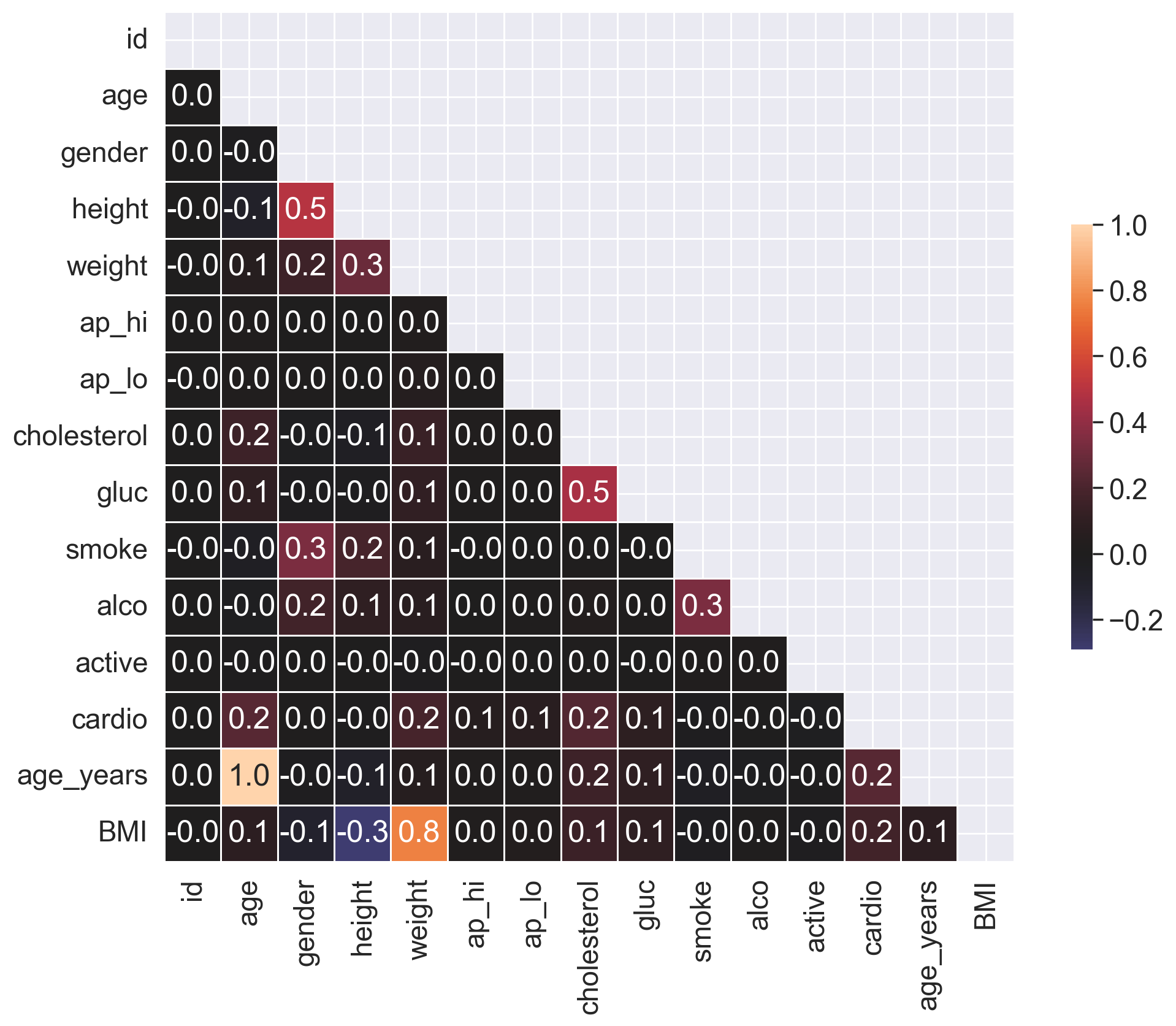
Question 2.1. (1 point). Which pair of features has the strongest Pearson’s correlation with the gender feature?
Cardio, Cholesterol
Height, Smoke
Smoke, Alco
Height, Weight
Answer: 2.
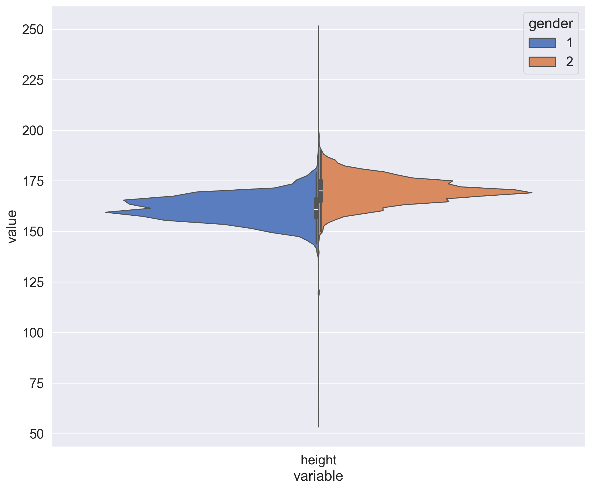
2.2. Height distribution of men and women#
From our exploration of the unique values we know that the gender is encoded by the values 1 and 2. And though you don’t have a specification of how these values correspond to men and women, you can figure that out graphically by looking at the mean values of height and weight for each value of the gender feature.
Task:#
Create a violin plot for the height and gender using violinplot(). Use the parameters:
hueto split by gender;scaleto evaluate the number of records for each gender.
In order for the plot to render correctly, you need to convert your DataFrame to long format using the melt() function from pandas. Here is another example of this.
Solution:#
df_melt = pd.melt(frame=df, value_vars=["height"], id_vars=["gender"])

plt.figure(figsize=(12, 10))
ax = sns.violinplot(
    x="variable",
    y="value",
    hue="gender",
    palette="muted",
    split=True,
    data=df_melt,
    scale="count",
    scale_hue=False,
)
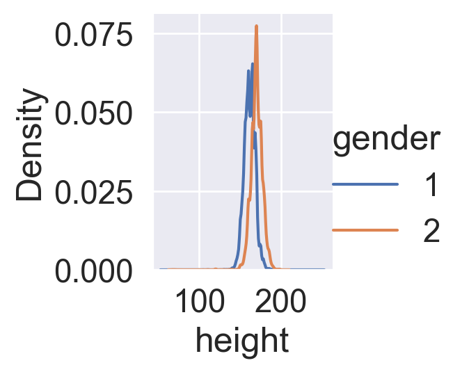
Task:#
Create two kdeplots of the height feature for each gender on the same chart. You will see the difference between the genders more clearly, but you will be unable to evaluate the number of records in each of them.
Solution:#
sns.FacetGrid(df, hue="gender").map(sns.kdeplot, "height").add_legend();
2.3. Rank correlation#
In most cases, the Pearson coefficient of linear correlation is more than enough to discover patterns in data. But let’s go a little further and calculate a rank correlation. It will help us to identify such feature pairs in which the lower rank in the variational series of one feature always precedes the higher rank in the another one (and we have the opposite in the case of negative correlation).
Task:#
Calculate and plot a correlation matrix using the Spearman’s rank correlation coefficient.
Solution:#
# Calculate the correlation matrix
corr = df[
    ["id", "age", "height", "weight", "ap_hi", "ap_lo", "cholesterol", "gluc"]
].corr(method="spearman")

# Create a mask to hide the upper triangle of the correlation matrix (which is symmetric)
mask = np.zeros_like(corr, dtype=np.bool_)
mask[np.triu_indices_from(mask)] = True

f, ax = plt.subplots(figsize=(12, 10))

# Plot the heatmap using the mask and correct aspect ratio
sns.heatmap(
    corr,
    mask=mask,
    vmax=1,
    center=0,
    annot=True,
    fmt=".2f",
    square=True,
    linewidths=0.5,
    cbar_kws={"shrink": 0.5},
);
Question 2.2. (1 point). Which pair of features has the strongest Spearman rank correlation?
Height, Weight
Age, Weight
Cholesterol, Gluc
Cardio, Cholesterol
Ap_hi, Ap_lo
Smoke, Alco
Answer: 5.
Question 2.3. (1 point). Why do these features have strong rank correlation?
Inaccuracies in the data (data acquisition errors).
Relation is wrong, these features should not be related.
Nature of the data.
Answer: 3.
2.4. Age#
Previously we calculated the age of the respondents in years at the moment of examination.
Task:#
Create a count plot using countplot(), with the age on the X axis and the number of people on the Y axis. Each value of the age should have two columns corresponding to the numbers of people of this age for each cardio class.
Solution:#
sns.countplot(x="age_years", hue="cardio", data=df);
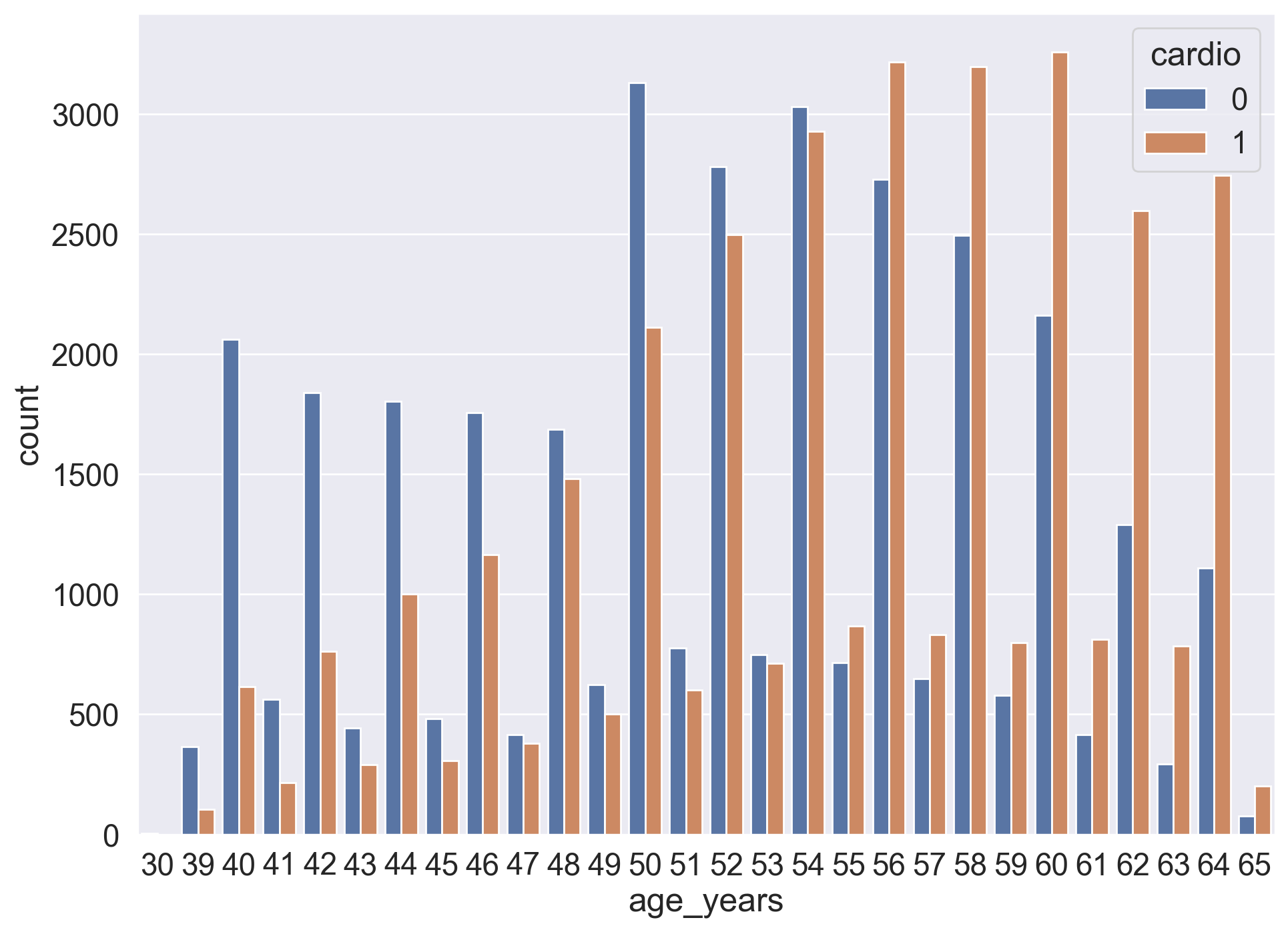
Question 2.4. (1 point). What is the smallest age at which the number of people with CVD outnumbers the number of people without CVD?
44
55
64
70
Answer: 2.