Visual data analysis in Python. Part 2. Overview of Seaborn, Matplotlib and Plotly libraries#

Author: Egor Polusmak. Translated and edited by Alena Sharlo, Yury Kashnitsky, Artem Trunov, Anastasia Manokhina, and Yuanyuan Pao. This material is subject to the terms and conditions of the Creative Commons CC BY-NC-SA 4.0 license. Free use is permitted for any non-commercial purpose.
Article outline#
1. Dataset#
First, we will set up our environment by importing all necessary libraries. We will also change the display settings to better show plots.
# Matplotlib forms basis for visualization in Python
import matplotlib.pyplot as plt

# We will use the Seaborn library
import seaborn as sns

sns.set()

# Graphics in SVG format are more sharp and legible
%config InlineBackend.figure_format = 'svg'

# Increase the default plot size and set the color scheme
plt.rcParams["figure.figsize"] = (8, 5)
plt.rcParams["image.cmap"] = "viridis"
import pandas as pd
Now, let’s load the dataset that we will be using into a DataFrame. I have picked a dataset on video game sales and ratings from Kaggle Datasets.
Some of the games in this dataset lack ratings; so, let’s filter for only those examples that have all of their values present.
# for Jupyter-book, we copy data from GitHub, locally, to save Internet traffic,
# you can specify the data/ folder from the root of your cloned
# https://github.com/Yorko/mlcourse.ai repo, to save Internet traffic
DATA_URL = "https://raw.githubusercontent.com/Yorko/mlcourse.ai/main/data/"
df = pd.read_csv(DATA_URL + "video_games_sales.csv").dropna()
print(df.shape)
(6825, 16)
Next, print the summary of the DataFrame to check data types and to verify everything is non-null.
df.info()
<class 'pandas.core.frame.DataFrame'>
Index: 6825 entries, 0 to 16706
Data columns (total 16 columns):
 #   Column           Non-Null Count  Dtype
---  ------           --------------  -----
 0   Name             6825 non-null   object
 1   Platform         6825 non-null   object
 2   Year_of_Release  6825 non-null   float64
 3   Genre            6825 non-null   object
 4   Publisher        6825 non-null   object
 5   NA_Sales         6825 non-null   float64
 6   EU_Sales         6825 non-null   float64
 7   JP_Sales         6825 non-null   float64
 8   Other_Sales      6825 non-null   float64
 9   Global_Sales     6825 non-null   float64
 10  Critic_Score     6825 non-null   float64
 11  Critic_Count     6825 non-null   float64
 12  User_Score       6825 non-null   object
 13  User_Count       6825 non-null   float64
 14  Developer        6825 non-null   object
 15  Rating           6825 non-null   object
dtypes: float64(9), object(7)
memory usage: 906.4+ KB
We see that pandas has loaded some of the numerical features as object type. We will explicitly convert those columns into float and int.
df["User_Score"] = df["User_Score"].astype("float64")
df["Year_of_Release"] = df["Year_of_Release"].astype("int64")
df["User_Count"] = df["User_Count"].astype("int64")
df["Critic_Count"] = df["Critic_Count"].astype("int64")
The resulting DataFrame contains 6825 examples and 16 columns. Let’s look at the first few entries with the head() method to check that everything has been parsed correctly. To make it more convenient, I have listed only the variables that we will use in this notebook.
useful_cols = [
    "Name",
    "Platform",
    "Year_of_Release",
    "Genre",
    "Global_Sales",
    "Critic_Score",
    "Critic_Count",
    "User_Score",
    "User_Count",
    "Rating",
]
df[useful_cols].head()
| Name | Platform | Year_of_Release | Genre | Global_Sales | Critic_Score | Critic_Count | User_Score | User_Count | Rating | |
|---|---|---|---|---|---|---|---|---|---|---|
| 0 | Wii Sports | Wii | 2006 | Sports | 82.53 | 76.0 | 51 | 8.0 | 322 | E |
| 2 | Mario Kart Wii | Wii | 2008 | Racing | 35.52 | 82.0 | 73 | 8.3 | 709 | E |
| 3 | Wii Sports Resort | Wii | 2009 | Sports | 32.77 | 80.0 | 73 | 8.0 | 192 | E |
| 6 | New Super Mario Bros. | DS | 2006 | Platform | 29.80 | 89.0 | 65 | 8.5 | 431 | E |
| 7 | Wii Play | Wii | 2006 | Misc | 28.92 | 58.0 | 41 | 6.6 | 129 | E |
2. DataFrame.plot()#
Before we turn to Seaborn and Plotly, let’s discuss the simplest and often most convenient way to visualize data from a DataFrame: using its own plot() method.
As an example, we will create a plot of video game sales by country and year. First, let’s keep only the columns we need. Then, we will calculate the total sales by year and call the plot() method on the resulting DataFrame.
df[[x for x in df.columns if "Sales" in x] + ["Year_of_Release"]].groupby(
    "Year_of_Release"
).sum().plot();

Note that the implementation of the plot() method in pandas is based on matplotlib.
Using the kind parameter, you can change the type of the plot to, for example, a bar chart. matplotlib is generally quite flexible for customizing plots. You can change almost everything in the chart, but you may need to dig into the documentation to find the corresponding parameters. For example, the parameter rot is responsible for the rotation angle of ticks on the x-axis (for vertical plots):
df[[x for x in df.columns if "Sales" in x] + ["Year_of_Release"]].groupby(
    "Year_of_Release"
).sum().plot(kind="bar", rot=45);

3. Seaborn#
Now, let’s move on to the Seaborn library. seaborn is essentially a higher-level API based on the matplotlib library. Among other things, it differs from the latter in that it contains more adequate default settings for plotting. By adding import seaborn as sns; sns.set() in your code, the images of your plots will become much nicer. Also, this library contains a set of complex tools for visualization that would otherwise (i.e. when using bare matplotlib) require quite a large amount of code.
pairplot()#
Let’s take a look at the first of such complex plots, a pairwise relationships plot, which creates a matrix of scatter plots by default. This kind of plot helps us visualize the relationship between different variables in a single output.
# `pairplot()` may become very slow with the SVG format
%config InlineBackend.figure_format = 'png'
sns.pairplot(
    df[["Global_Sales", "Critic_Score", "Critic_Count", "User_Score", "User_Count"]]
);
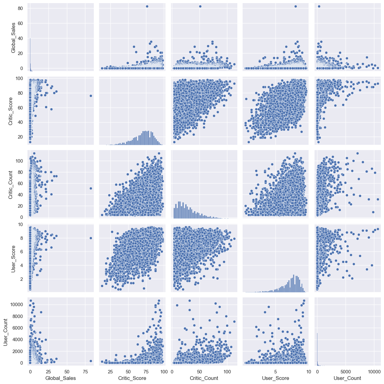
As you can see, the distribution histograms lie on the diagonal of the matrix. The remaining charts are scatter plots for the corresponding pairs of features.
histplot()#
It is also possible to plot a distribution of observations with seaborn’s histplot(). For example, let’s look at the distribution of critics’ ratings: Critic_Score.
%config InlineBackend.figure_format = 'svg'
sns.histplot(df["Critic_Score"], kde=True, stat="density");

jointplot()#
To look more closely at the relationship between two numerical variables, you can use joint plot, which is a cross between a scatter plot and histogram. Let’s see how the Critic_Score and User_Score features are related.
sns.jointplot(x="Critic_Score", y="User_Score", data=df, kind="scatter");

boxplot()#
Another useful type of plot is a box plot. Let’s compare critics’ ratings for the top 5 biggest gaming platforms.
top_platforms = (
    df["Platform"].value_counts().sort_values(ascending=False).head(5).index.values
)
sns.boxplot(
    y="Platform",
    x="Critic_Score",
    data=df[df["Platform"].isin(top_platforms)],
    orient="h",
);

It is worth spending a bit more time to discuss how to interpret a box plot. Its components are a box (obviously, this is why it is called a box plot), the so-called whiskers, and a number of individual points (outliers).
The box by itself illustrates the interquartile spread of the distribution; its length determined by the \(25\% \, (\text{Q1})\) and \(75\% \, (\text{Q3})\) percentiles. The vertical line inside the box marks the median (\(50\%\)) of the distribution.
The whiskers are the lines extending from the box. They represent the entire scatter of data points, specifically the points that fall within the interval \((\text{Q1} - 1.5 \cdot \text{IQR}, \text{Q3} + 1.5 \cdot \text{IQR})\), where \(\text{IQR} = \text{Q3} - \text{Q1}\) is the interquartile range.
Outliers that fall out of the range bounded by the whiskers are plotted individually.
heatmap()#
The last type of plot that we will cover here is a heat map. A heat map allows you to view the distribution of a numerical variable over two categorical ones. Let’s visualize the total sales of games by genre and gaming platform.
platform_genre_sales = (
    df.pivot_table(
        index="Platform", columns="Genre", values="Global_Sales", aggfunc="sum"
    )
    .fillna(0)
    .map(float)
)
sns.heatmap(platform_genre_sales, annot=True, fmt=".1f", linewidths=0.5);

4. Plotly#
We have examined some visualization tools based on the matplotlib library. However, this is not the only option for plotting in Python. Let’s take a look at the plotly library. Plotly is an open-source library that allows creation of interactive plots within a Jupyter notebook without having to use Javascript.
The real beauty of interactive plots is that they provide a user interface for detailed data exploration. For example, you can see exact numerical values by mousing over points, hide uninteresting series from the visualization, zoom in onto a specific part of the plot, etc.
Before we start, let’s import all the necessary modules and initialize plotly by calling the init_notebook_mode() function.
import plotly
import plotly.graph_objs as go
from plotly.offline import download_plotlyjs, init_notebook_mode, iplot, plot
from IPython.display import display, IFrame

init_notebook_mode(connected=True)

def plotly_depict_figure_as_iframe(fig, title="", width=800, height=500,
  plot_path='../../_static/plotly_htmls/'):
  """
  This is a helper method to visualize Plotly plots as Iframes in a Jupyter book.
  If you are running `jupyter-notebook`, you can just use iplot(fig).
  """

  # in a Jupyter Notebook, the following should work
  #iplot(fig, show_link=False)

  # in a Jupyter Book, we save a plot offline and then render it with IFrame
  fig_path_path = f"{plot_path}/{title}.html"
  plot(fig, filename=fig_path_path, show_link=False, auto_open=False);
  display(IFrame(fig_path_path, width=width, height=height))
Line plot#
First of all, let’s build a line plot showing the number of games released and their sales by year.
years_df = (
    df.groupby("Year_of_Release")[["Global_Sales"]]
    .sum()
    .join(df.groupby("Year_of_Release")[["Name"]].count())
)
years_df.columns = ["Global_Sales", "Number_of_Games"]
Figure is the main class and a work horse of visualization in plotly. It consists of the data (an array of lines called traces in this library) and the style (represented by the layout object). In the simplest case, you may call the iplot function to return only traces.
The show_link parameter toggles the visibility of the links leading to the online platform plot.ly in your charts. Most of the time, this functionality is not needed, so you may want to turn it off by passing show_link=False to prevent accidental clicks on those links.
# Create a line (trace) for the global sales
trace0 = go.Scatter(x=years_df.index, y=years_df["Global_Sales"], name="Global Sales")

# Create a line (trace) for the number of games released
trace1 = go.Scatter(
    x=years_df.index, y=years_df["Number_of_Games"], name="Number of games released"
)

# Define the data array
data = [trace0, trace1]

# Set the title
layout = {"title": "Statistics for video games"}

# Create a Figure and plot it
fig = go.Figure(data=data, layout=layout)

# in a Jupyter Notebook, the following should work
#iplot(fig, show_link=False)

# in a Jupyter Book, we save a plot offline and then render it with IFrame
plotly_depict_figure_as_iframe(fig, title="topic2_part2_plot1")
As an option, you can save the plot in an html file:
# commented out as it produces a large in size file
#plotly.offline.plot(fig, filename="years_stats.html", show_link=False, auto_open=False);
Bar chart#
Let’s use a bar chart to compare the market share of different gaming platforms broken down by the number of new releases and by total revenue.
# Do calculations and prepare the dataset
platforms_df = (
    df.groupby("Platform")[["Global_Sales"]]
    .sum()
    .join(df.groupby("Platform")[["Name"]].count())
)
platforms_df.columns = ["Global_Sales", "Number_of_Games"]
platforms_df.sort_values("Global_Sales", ascending=False, inplace=True)
# Create a bar for the global sales
trace0 = go.Bar(
    x=platforms_df.index, y=platforms_df["Global_Sales"], name="Global Sales"
)

# Create a bar for the number of games released
trace1 = go.Bar(
    x=platforms_df.index,
    y=platforms_df["Number_of_Games"],
    name="Number of games released",
)

# Get together the data and style objects
data = [trace0, trace1]
layout = {"title": "Market share by gaming platform"}

# Create a `Figure` and plot it
fig = go.Figure(data=data, layout=layout)
# in a Jupyter Notebook, the following should work
#iplot(fig, show_link=False)

# in a Jupyter Book, we save a plot offline and then render it with IFrame
plotly_depict_figure_as_iframe(fig, title="topic2_part2_plot2")
Box plot#
plotly also supports box plots. Let’s consider the distribution of critics’ ratings by the genre of the game.
data = []

# Create a box trace for each genre in our dataset
for genre in df.Genre.unique():
    data.append(go.Box(y=df[df.Genre == genre].Critic_Score, name=genre))

# Visualize
# in a Jupyter Notebook, the following should work
#iplot(data, show_link=False)

# in a Jupyter Book, we save a plot offline and then render it with IFrame
plotly_depict_figure_as_iframe(data, title="topic2_part2_plot3")
Using plotly, you can also create other types of visualization. Even with default settings, the plots look quite nice. Additionally, the library makes it easy to modify various parameters: colors, fonts, captions, annotations, and so on.
5. Useful resources#
The same notebook as an interactive web-based Kaggle Kernel
“Plotly for interactive plots” - a tutorial by Alexander Kovalev within mlcourse.ai (full list of tutorials is here)
“Bring your plots to life with Matplotlib animations” - a tutorial by Kyriacos Kyriacou within mlcourse.ai
“Some details on Matplotlib” - a tutorial by Ivan Pisarev within mlcourse.ai
Main course site, course repo, and YouTube channel
Medium “story” based on this notebook
Course materials as a Kaggle Dataset
If you read Russian: an article on Habrahabr with ~ the same material. And a lecture on YouTube
Here is the official documentation for the libraries we used:
matplotlib,seabornandpandas.The gallery of sample charts created with
seabornis a very good resource.Also, see the documentation on Manifold Learning in
scikit-learn.Efficient t-SNE implementation Multicore-TSNE.
“How to Use t-SNE Effectively”, Distill.pub.